Tidal Patterns of Human Mobility

SHARE:
Every day, tens of millions of user trips and 30 percent additional worker movements, shuffle continuously bikes in shared stations at cities across the world. The vast amounts of data from this complex activity have brought scientists in front of challenging questions, not just about bike sharing, but most importantly, about the future of more advanced on-demand mobility systems like autonomous cars. Are human mobility patterns random or predictable? To what extent does form of a city affect its mobility pattern? Are there similarities in behavior between MoD systems in different cities?
We analyzed a dataset of 620K trips and 32M station updates from Boston’s bike sharing system during 2012. We discovered that even though trip patterns are random, their net effect on inventory patterns is stable and predictable. Independently of topology, users always move vehicles from residential to commercial areas in the morning, from commercial to residential areas in the evening, and from shortage to surplus areas throughout the day. For workers, it is the other way around. This palindromic tidal movement is consistent across systems, suggesting similarities in movement patterns across cities. Our discovery provides a new perspective in the regularity of complex behavior in on-demand shared systems.

Data

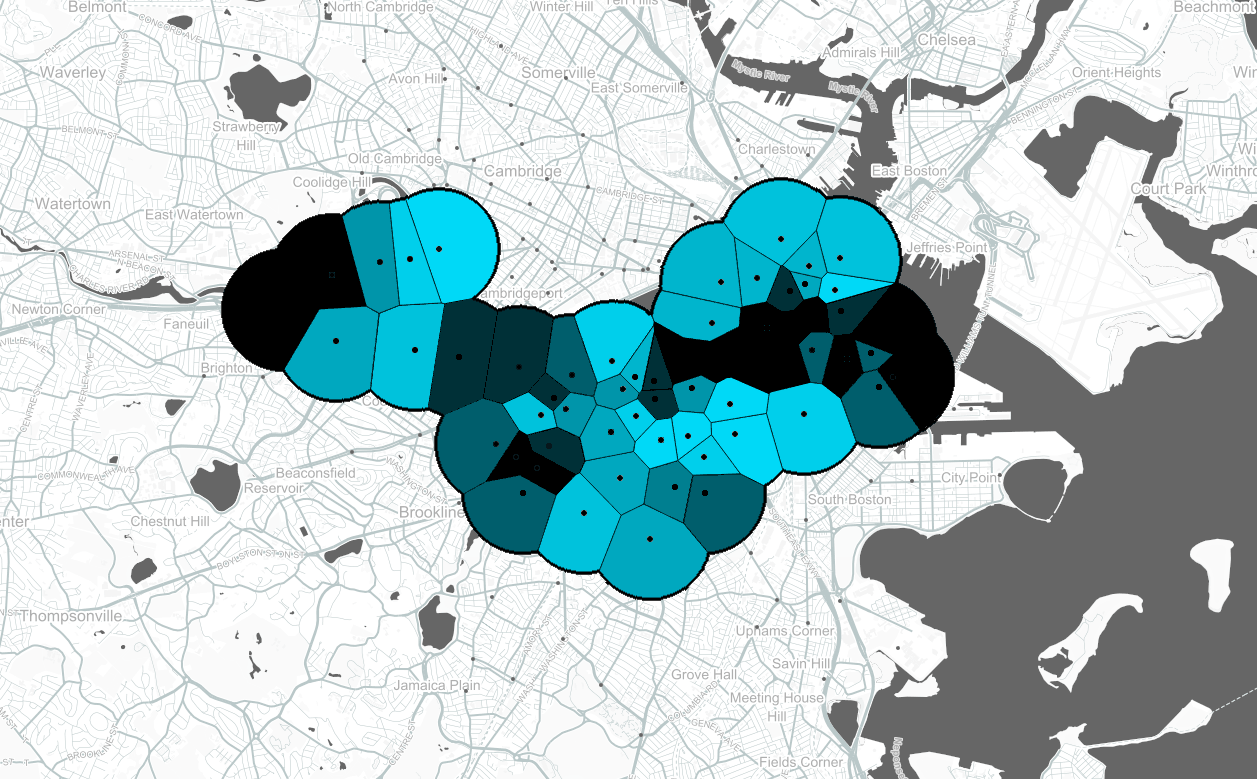
We used a dataset that Hubway released publicly in 2013 as part of the “Hubway Data Visualization Challenge”. The dataset includes 623,509 trips in CSV format that occurred in Hubway from July 28, 2011 till October 1, 2012. In this study, we focused on the month of June 2012 using Tuesday, the 19th, as a reference day. During this month, Hubway had 61 active stations, it had an average active stock of bikes in circulation of 550 bikes. Each entry in the trip dataset consists of 13 comma separated values: id, status, duration, start_date, start_station, end_date, end_station, bike_nr, subscription_type, zip_code, birth_date, gender. Example:

  							288373,Closed,3052,2012-05-31 16:11:00,45,2012-05-31 17:02:00,63,B00613,Registered,2464,1980,Male
  							288374,Closed,221,2012-05-31 16:12:00,43,2012-05-31 16:16:00,40,B00161,Registered,2110,1946,Male
  							288375,Closed,1101,2012-05-31 16:12:00,64,2012-05-31 16:30:00,64,B00084,Registered,2210,1988,Male
  						
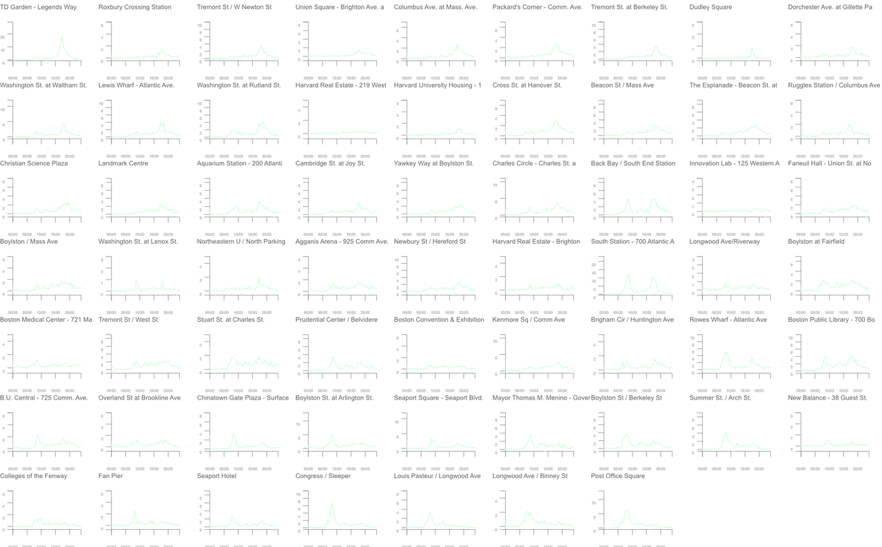
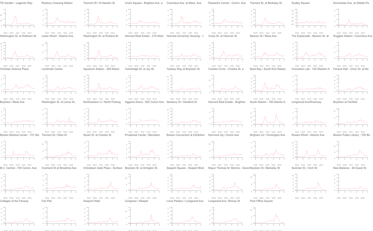
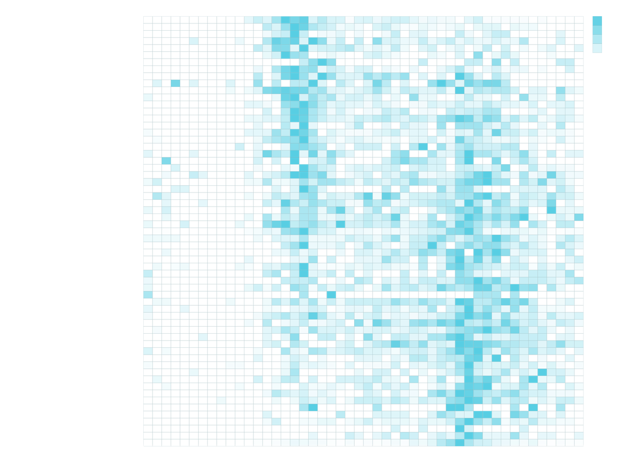
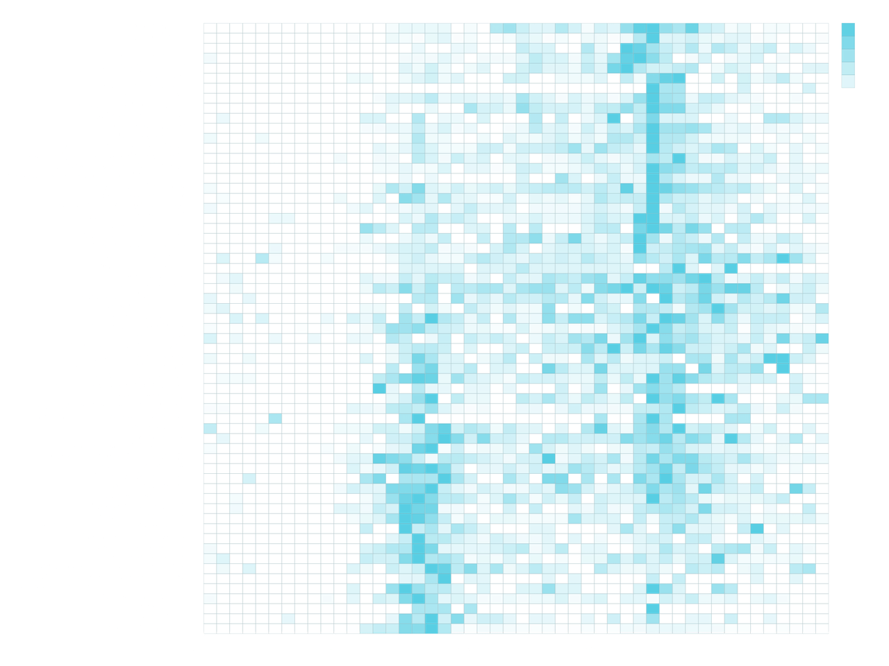
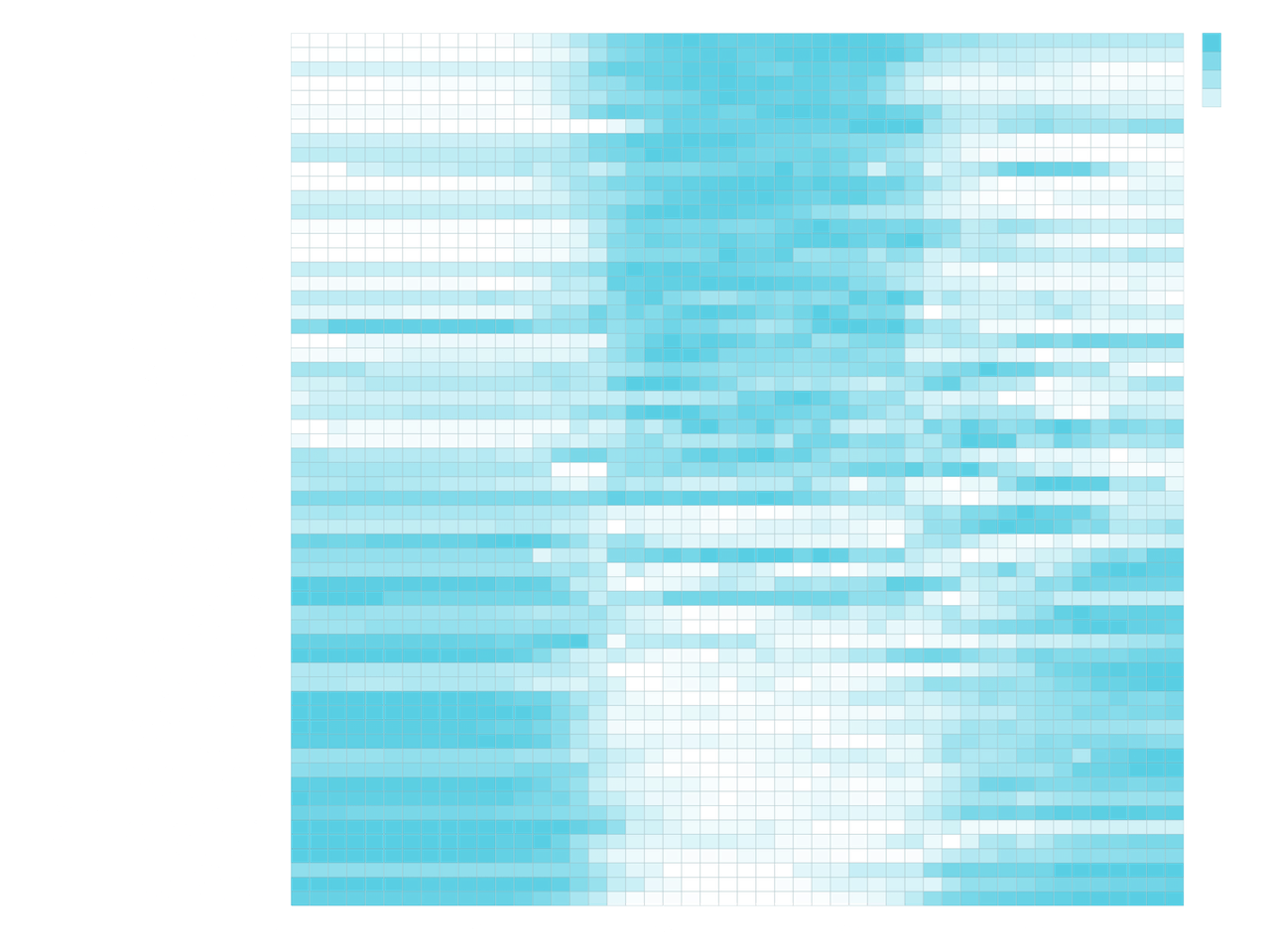
A time lapse over 24hrs reveals a palindromic tidal pattern at inventory stocks. However, this way of visualization is insufficient to understand the extent of the regularity of the pattern.

Computing Inflows and Outflows from Trips

To reconstruct the trajectory of the system in time, I calculated local outflow and inflow rates per station and I integrated the trajectory that the system would have if no rebalancing took place. This was done by iterating over time and for each time step, for each station, deriving the inventory level by subsequently adding arrivals and removing departures.

Two Dimensions of Ordering

To visually reveal the hidden regular macroscopic patterns of commuting, we classified and ordered stations based on how residential, commercial, surplus, or shortage, their activity patterns are. To classify a station we compared the shapes of its departures (outflow) and arrivals (inflow) temporal distributions: The more skewed to the left the departures distribution compared to the arrivals distribution is, the more residential the pattern of the station is. The greater the volume of the inflow distribution compared to the outflow distribution is, the more surplus the pattern of the station is. This provides a common framework to study similarities in the dynamics across seemingly diverse and heterogeneous systems.